One of the things makers tell me they want their product photos to do is to tell a story. The reason lifestyle photos are so popular with email and social media marketing is because they create an emotional connection for the buyer. And what better way to tell a story of your handmade product than with props in your photography?
If you’re a maker and you’re using props in your product photos, you need to make sure you’re using props that make sense and don’t look random next to your product. The last thing you want is your product photo to look messy or amateurish which may turn off customers.
Now let’s say you have your props selected and you think they’re going to look great with your handmade product, but when you take your photos, it doesn't look anything like the lifestyle photos you see online. You know something is off, but what is it??
How the color of your props influence your product photos
Something that is easily overlooked when incorporating props in your product photos is what color they are. When using props that are different colors, you may be creating more visual clutter and taking the focus away from your handmade product which isn’t something you want to do. Whether you’re using props or not, your product always needs to be the main focal point of the photo.
So let’s go over some examples of how you can make your photos look more professional and your handmade product stand out all by changing up the color of your props.
In this photo, we have a few things going on. We have a stack of books, a plant and a Buddha figurine. This is the type of lifestyle photo I see often on Etsy and while I understand the intention behind it, it isn’t a photo that is going to have a major impact on a customer’s decision to buy from you.
At first glance, it looks like someone just grabbed some books, a plant and a figurine and took a photo. There’s nothing in partial that stands out and frankly, it looks like there was zero thought put into the photo.

Too many colors can make it hard to see what you're selling
If you look at this photo, what stands out to you? The books? The plant? The figurine? Can you easily tell what the main subject (or product) is of the photo? Well, believe it or not it’s the Buddha figurine.
But it’s hard to tell because it’s the smallest thing in the photo and everything else in relation is so much bigger. The stack of books are calling my attention due to the different colors as are the book titles.
The plant is okay but feels a bit random. So let’s see if we can make this photo look less random and more cohesive. Let’s switch out the books and see how that changes the photo.

1. Start simplifying by selecting props that are similar in color
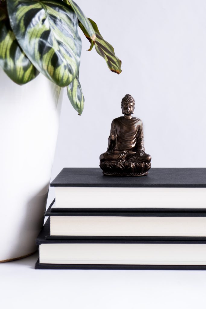
In this photo, I changed out the books and decided to select books that have a black cover. Not only does this help create more visual cohesiveness, I turned the spines of the books away so you can’t see the book titles since there’s no real purpose to seeing the titles.
I also moved the Buddha a bit closer to the plant and moved my camera closer so you could see the figurine better since that’s what I want you to focus on. As a result, the photo looks less cluttered and feels much cleaner. What a change it is from the previous photo.
But the photo feels a bit dark so let’s see what happens when I switch out the plant for one with a lighter colored pot.

2. Brighten your product photos with lighter colored props
In this photo, I selected a plant with a white pot which really lightens up the photo. It feels cleaner and brighter, but the black covered books feel a little too dark, especially because the Buddha itself is dark too. So let’s see what happens when I switch out the books for a different color.

In this photo, I went with books that have white covers which really brightens up the photo overall. The Buddha figurine definitely stands out much more when the props are all much lighter in color.
Now, the photo feels as though it could be someone’s bedside table or someone’s fireplace mantel which wasn’t the story or feeling I got with the initial photo.
Keep it simple
Remember when selecting props, keep it simple. Usually the less you have, the better because you run the risk of making your photo too busy. Be sure to pick a color palette that complements your product well and doesn’t compete with it.
The more intentional you are with your props, the better they’ll look in your photos.
What are your favorite props to use in your product photos? Leave a comment below and let me know!

This article is spot on. I am learning about props when staging my bags. Thanks for the good, better, best photos to compare the differences.
Thanks, Cindy! I’m glad it was helpful. It does take practice when it comes to staging products so experiment and see what works best for your products and brand.